As a Canadian packaging compliance specialist and French translator, I see Canadian product packaging from a number of industries every single day. Despite this, there are still subtle rules that manage to surprise me.
Take for example the numerical quantity font rule. As a graphic designer, you may be familiar with the font height rules for the principal display surface of Canadian packaging – but did you know that the minimum font size for the numerical quantity declaration is actually larger than that for regular text?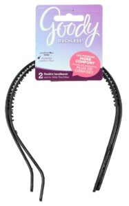
The Canadian government packaging rules dictate that the net quantity must be shown in bold face type in a font no smaller than the following height:
• 1/16 inch (1.6 mm) where the principal surface area is not more than 5 square inches (32 square cm)
• 1/8 inch (3.2 mm) where the principal surface area is more than 5 square inches (32 square cm) but not more than 40 square inches (258 square cm)
• 1/4 inch (6.4 mm) where the principal surface area is more than 40 square inches (258 square cm) but not more than 100 square inches (645 square cm)
• 3/8 inch (9.5 mm) where the principal surface area is more than 100 square inches (645 square cm) but not more than 400 square inches (25.8 square decimetres)
• 1/2 inch (12.7 mm) where the principal surface area is more than 400 square inches (25.8 square decimetres)
If you’re already struggling to make your bilingual packaging design appear streamlined, this additional Canadian packaging regulation could be frustrating. However, the fix is quite simple and even esthetically pleasing:
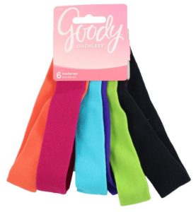
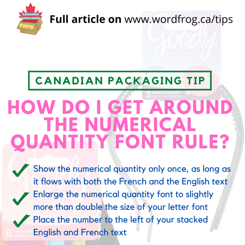
Although the quantity must be listed in both languages, you may show the numerical quantity only once, as long as it flows with both the French and the English text. Your simple solution? Enlarge the numerical quantity font to slightly more than double the size of your letter font, and place the number to the left of your stacked English and French text (typically with English at the top, French on the bottom).
As you can see in these examples, the popular hair accessory manufacturer Goody has applied this rule in its Canadian packaging and in my opinion, it looks more like an intentional design choice than it does a packaging compliance regulation.
For more Canadian packaging design tips, follow me at @canadianpackagingtips or visit my blog at www.wordfrog.ca/tips